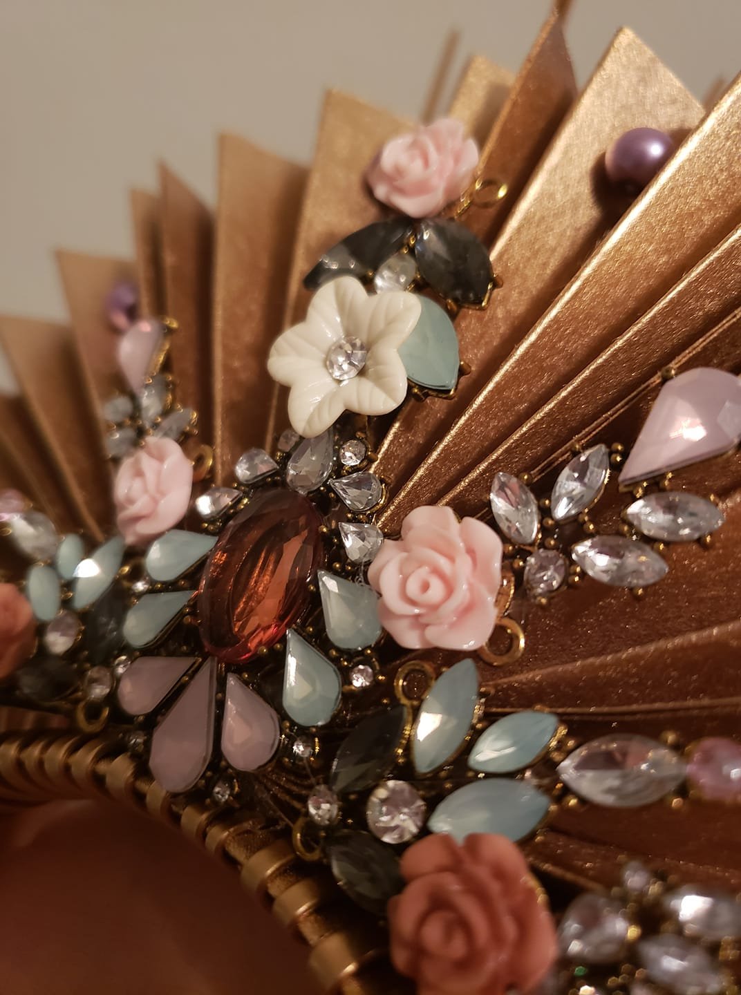
Enchanting Adornments
Handcrafted Beauty
Logo Design & Brand Identity
INTRO
Beauty takes many shapes, others are worn. Crowns have been a symbol throughout history as a representation of significance & power. They are usually adorned with gold & jewels, but Mikaela Carson believes that nature is the highest form of these aspects. They design their adornments with natural resources - such as flowers, stems, shells & much more. They wanted to have a brand that would carry this idea along with a cosmic aesthetic.
Concept
When Mikaela sent me their design inspiration, many fell in the realm of tattoos & tarot cards. These designs are usual melted down to a minimal structure with blips of detail & beauty. They wanted to have to flower, a crystal, and a crown naturally into the logo. Something hand-drawn was necessary to have the logo feel natural & organic.
Style-Guides are an important ingredient when thinking of the final design. After various concepts & revisions have been achieved, the Style-Guide is presented to the client as a navigation for their brand. It’s something that should be kept simple & clean, easy to follow & perfectly represent the brand.
Result
Purple is the color that stands for royalty. This color was a given to be used as a primary color for the logo. We made a jewel that grows with potential - accented with pedals to show that life can be found in the most unusual places. It glimmers above a hand that appears relaxed & comfortable with what’s being held - much like they crowns Mikaela creates for her clients. The crown centered in the text is also worn comfortable with perfect symmetry.
“Greg was not only able to translate my vision to a T, he was very patient on any feedback I had to logo design. I’m in love with the final result - it’s a perfect reflection of what Enchanting Adornments represents.”
- Mikaela Carson
Owner & Lead Craftsman


